
What book-cover clichés are secretly trying to tell you
We have been told our entire lives not to judge a book by its cover. This is terrible advice for buying books.
Book covers are designed to be judged. Before you read a single word of the description, that ominous mansion, enormous title, illustrated couple, or suspiciously prominent cat is already telling you what kind of story you're holding.
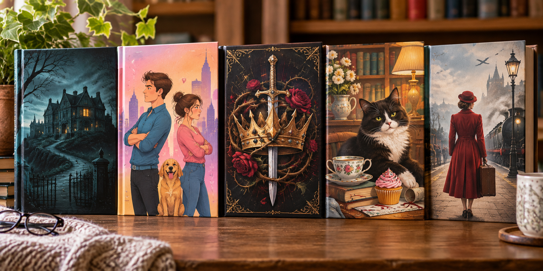
Publishers have developed a visual language for books, and once you know how to read it, you start seeing the same characters everywhere. The mysterious woman walking away. The cozy mystery cat who has apparently witnessed seventeen homicides. The fantasy crown surrounded by thorns. The romance couple who absolutely refuse to make eye contact.
So forget the old rule. We're judging books by their covers, and we're going to get really specific about it.
1. THE TITLE IS THE COVER
You know this book. You can spot it from three aisles away.
The title isn't on the cover. The title is the cover.
There might technically be an image behind it. Perhaps a city skyline, a shadowy figure, some smoke, or an object of tremendous geopolitical importance. You wouldn't know, because THE LAST CONSPIRACY is occupying approximately 87 percent of the available real estate.
And sometimes the author's name is even bigger.
This is the natural habitat of the blockbuster thriller, where subtlety would merely make the book harder to see from across Costco.
But there's a reason publishers do it. These covers aren't necessarily selling you an image or even a particular story. They're selling recognition, urgency, and brand. If you already know the author, their name may be the most important piece of information on the cover.
What the cover is telling you:
You know why you're here.
2. THE MYSTERIOUS WOMAN HAS HER BACK TO US
Who is she?
We don't know. She won't turn around.
She may be standing on a windswept beach. Walking toward an old house. Gazing across the English countryside. Carrying a suitcase toward a train station. Occasionally she's wearing a very nice coat.
But one thing is certain: this woman has been through some shit.
The Woman Facing Away is especially fond of historical fiction, family sagas, and stories involving long-buried secrets. Give her a 1940s dress, a European city in the background, and a slightly desaturated color palette, and there is an excellent chance somebody is about to discover a letter hidden in an attic.
Why don't we ever see her face? Because the mystery is part of the sales pitch. A faceless figure lets the reader imagine the character while instantly communicating longing, secrets, distance, loss, and Important Things That Happened in the Past.
Extra points if there is also:
- a train
- a suitcase
- an old photograph
- a manor house
- a dramatic sky
- World War II
What the cover is telling you:
This woman has a secret, and there's at least a 40 percent chance it involves World War II.
3. THE ILLUSTRATED ROMANCE COUPLE WHO REFUSE TO LOOK AT EACH OTHER
You know them.
They're attractive. They're color-coordinated. They're standing approximately six inches apart.
And they are absolutely not going to acknowledge each other's existence.
She is looking left. He is looking right. Perhaps they're back-to-back. Maybe one of them has crossed their arms. If they're feeling especially daring, they might glance sideways at each other with expressions suggesting they have just been informed they'll have to share a hotel room.
They are, of course, going to fall madly in love.
The illustrated romance cover has become one of the most recognizable sights in modern bookstores. Bright colors, playful typography, simplified characters, and little visual clues tell you what flavor of romantic chaos you're about to encounter.
Apron? Bakery romance.
Bookshelves? Bookstore romance.
Laptop? Workplace romance.
Palm trees? Vacation romance.
Snowflakes? Christmas romance.
Two people glaring at each other? Enemies to lovers. Deploy immediately.
And if there is a dog between them, that dog will almost certainly accomplish more for their relationship in 300 pages than either adult manages through direct communication.
There is a practical reason these covers work so well. Unlike the classic clinch covers of traditional romance, illustrated covers can signal fun, warmth, humor, and chemistry without depicting an actual intimate scene. They also make books from the same genre instantly recognizable when they're lined up together on a shelf.
There is, however, one danger.
Sometimes the cheerful cartoon people are concealing a book with considerably more emotional devastation, trauma, or spice than their adorable little illustrated faces would suggest.
That pastel cover may be lying to you.
What the cover is telling you:
These two people hate each other. Please allow 327 pages for this misunderstanding to be resolved.
4. PLEASE DO NOT ENTER THE OMINOUS HOUSE
There is a house on the cover.
It is large. It is old. It is isolated.
The weather is terrible.
And for some inexplicable reason, one light is on upstairs.
Do not buy this property.
Nothing good has ever happened inside Cover House. Someone was murdered there. Someone disappeared there. Someone's grandmother lived there and left behind a surprisingly complicated will. There is a locked room nobody talks about. The previous owner left suddenly. The townspeople become visibly uncomfortable when you mention the address.
Naturally, our protagonist has just inherited it.
Ominous houses are wonderfully efficient cover shorthand for gothic fiction, psychological thrillers, domestic suspense, and anything involving Family Secrets™. Sometimes they're grand country estates surrounded by fog. Sometimes they're ordinary suburban homes made deeply unsettling by shadows, strange windows, or the fact that there isn't another human being anywhere in sight.
And sometimes the house is at the end of a long driveway.
DO NOT GO UP THE DRIVEWAY.
The house works because it turns the setting into a character. Before we've even opened the book, we're wondering what happened there, what's inside, and why any rational human being would walk through the front door.
Unfortunately, rational humans make very short thrillers.
Bonus warning signs include:
- dead trees
- iron gates
- crows
- fog
- one upstairs window glowing
- a figure standing where no figure should be
- an aggressively red front door
- a title containing House, Home, Family, Guest, Wife, or Secret
If the cover includes a house AND a woman walking away from us, congratulations.
We have achieved Cover Trope Multiclassing.
What the cover is telling you:
The Zillow listing failed to disclose several important things.
5. THE COZY MYSTERY CAT HAS FOUND ANOTHER BODY
There is a cat on the cover.
This is unfortunate news for someone in town.
The cat may be sitting beside a teacup. Peeking out from behind a stack of books. Lounging in the window of a bakery. Perhaps it is delicately inspecting a ball of yarn.
Somewhere nearby, a human being is extremely dead.
Welcome to the cozy mystery.
Few cover tropes communicate an entire genre as efficiently as the Cozy Mystery Cat. Add a quaint storefront, some flowers, a cupcake, and perhaps a discreetly placed murder weapon, and we already know exactly what we're getting.
The town will be adorable.
The protagonist will probably own, work at, or frequent a charming small business.
The local police will be remarkably tolerant of civilian interference in homicide investigations.
And the cat will contribute almost nothing useful while nevertheless receiving top billing on the cover.
Occasionally the cat is joined by a dog, parrot, rabbit, or other suspiciously observant animal. But cats remain uniquely qualified for the job because they already look like they know who committed the murder and simply do not care enough to tell you.
Cozy mystery covers also perform an important bit of tonal work. There may be an actual corpse in Chapter Two, but the cheerful illustration reassures you that we're not here for gruesome autopsy details. We're here for clues, eccentric suspects, small-town gossip, baked goods, and an amateur sleuth who has now discovered an alarming number of bodies for someone who runs a yarn shop.
Bonus points for:
- teacups
- cupcakes
- bookshelves
- knitting supplies
- picturesque cottages
- a magnifying glass
- a murder weapon positioned adorably
- a cat staring directly at you as though you are the next suspect
What the cover is telling you:
Someone has been murdered, but don't worry. There will be muffins.
🐈🔪🧁
6. FANTASY COVERS HAVE RUN OUT OF UNUSED CROWNS
Fantasy has a supply-chain problem.
There are only so many crowns, swords, daggers, dragons, ravens, roses, and thorny vines available in the world, and the publishing industry appears determined to put every last one of them on a book cover.
Sometimes we get a single beautifully rendered sword floating against a dark background. Sometimes it's a crown that looks deeply uncomfortable to wear. Sometimes flowers have inexplicably wrapped themselves around a dagger, presumably because even deadly weapons need accessorizing.
And somewhere, inevitably, there is gold foil.
Fantasy covers have become exceptionally good at communicating not just fantasy, but what particular flavor of fantasy you're about to consume.
Ornate crown: Royal intrigue. Someone's succession plan has gone horribly wrong.
Sword: War, rebellion, quest, or a young woman discovering that she is considerably better at stabbing people than anyone anticipated.
Dragon: We have dragons. Frankly, no further marketing is necessary.
Roses + dagger: Romance is happening, but everyone involved is armed.
Black feathers: Something morally complicated is underway.
Tiny person beneath enormous castle: Pack snacks. We're going on a quest.
And then there are the titles.
Fantasy has collectively assembled a magnificent box of refrigerator magnets containing the words:
Blood. Shadow. Ash. Flame. Crown. Thorn. Bone. Storm. Iron. Silver. Night. Kingdom. Queen. Dragon.
Shake vigorously.
Select two or three.
Add of.
Congratulations. Your trilogy has a name. 🤣
Of course, the visual shorthand works. Fantasy readers can glance at a cover and immediately start making useful guesses about whether they're looking at epic fantasy, romantasy, dark fantasy, or something with enough court politics to require a family tree.
And when publishers really want our attention, they deploy the ultimate weapon:
special edition sprayed edges matching the cover.
At which point we cease evaluating the novel as literature and begin making small delighted noises while rotating it under the bookstore lights.
What the cover is telling you:
There is a kingdom in peril, someone has a secret claim to the throne, and at least one person is devastatingly attractive while holding a knife.
7. SPRAYED EDGES: WHEN THE BOOK BECOMES DÉCOR
Once upon a time, the edges of a book's pages had one job:
Be the edges of the pages.
Those days are over.
Now you pull a book off the shelf and discover that its edges have been sprayed electric blue. Or covered in flowers. Or printed with tiny dragons. Or designed to form an elaborate landscape when the book is closed.
Suddenly you aren't holding a book anymore.
You're holding A Collectible.
Sprayed edges have become one of publishing's most effective ways to transform an ordinary hardcover into something that makes readers say, “OOOOOH,” immediately followed by, “I don't need it,” immediately followed by purchasing it.
And publishers have escalated.
First we had solid colors.
Then gradients.
Then stenciled patterns.
Then elaborate scenes and designs that coordinate perfectly with the dust jacket.
At this rate, the next generation of special editions will have tiny animatronic dragons emerging from the page block.
The particularly dangerous specimens combine sprayed edges with foil stamping, illustrated endpapers, ribbon bookmarks, redesigned covers, and the words LIMITED EDITION.
At that point, the book has stopped competing with other books for your money.
It is competing with the part of your brain that collects Pretty Things.
There is also a peculiar psychological transformation that occurs after buying one.
Before purchase:
“Books are meant to be read.”
After purchase:
“DO NOT CRACK THE SPINE.”
And heaven help you if the design continues across multiple books in a series. Now you can't just buy one. There will be a visible gap on the shelf.
They know what they're doing.
What the cover is telling you:
You came here to buy a story. You are leaving with a decorative object you will protect like a museum artifact.
8. WHY DOES EVERY BOOK IN A GENRE START LOOK THE SAME?
Walk into a bookstore, find the romance section, and squint.
You can probably still tell you're looking at romance.
Do the same thing with fantasy, thrillers, cozy mysteries, or historical fiction, and there's a good chance you'll recognize the neighborhood before you can read a single title.
That's not an accident.
Book covers have their own visual language, and publishers know readers have learned to speak it.
If you love cozy mysteries, a cheerful little shop, a teacup, and a cat can catch your attention from across the aisle. If you read psychological thrillers, that lonely house under a threatening sky might be all it takes. Fantasy readers see an ornate dagger surrounded by roses and think, “Ah. Someone is going to fall in love and/or be stabbed.”
Probably both.
The problem is that once a cover style works, everybody notices.
One illustrated romance becomes a hit. Then another. Then twelve more. Soon the romance table looks like everyone in town was illustrated by the same extremely busy artist.
A particular style becomes shorthand for a genre, publishers use it because readers recognize it, readers recognize it because publishers keep using it, and eventually we arrive at:
CAT = MURDER.
CROWN = KINGDOM PROBLEMS.
PASTEL CARTOON PEOPLE = KISSING EVENTUALLY.
LONELY HOUSE = DO NOT GO IN THERE.
WOMAN FACING AWAY = FAMILY SECRET.
And this isn't necessarily a bad thing. A good cover has only a few seconds to catch your attention, especially when it's competing with hundreds of other books on a shelf or dozens of tiny thumbnails online. Familiar visual cues can help the right reader find the right book.
The trouble comes when the shorthand becomes so dominant that books with very different tones start wearing nearly identical outfits.
That adorable illustrated cover might contain a fluffy romantic comedy.
Or grief.
Or trauma.
Or enough explicit content to make that cute little cartoon flower blush.
The cover can tell you what shelf you're on. It can't always tell you exactly what you're getting.
What the cover is telling you:
You liked another book that looked like this. Please investigate.
9. WHEN THE COVER LIES TO YOU
We've spent the article learning the secret language of book covers.
Unfortunately, sometimes the book is a lying liar who lies. 😂
A bright illustrated cover can look like a fluffy rom-com and deliver grief, trauma, and emotional devastation. A brooding gothic cover can disguise something much more romantic. A redesigned classic can look remarkably like whatever genre happens to be selling well at the moment.
And then there's the most treacherous offender of all:
The movie tie-in cover.
You loved the original cover. You know the original cover. You go to buy another copy and suddenly THERE ARE ACTORS ON IT.
Worse:
NOW A MAJOR MOTION PICTURE
printed directly on the artwork in a fake sticker that YOU CANNOT REMOVE.
🤣
What the cover is telling you:
Marketing has made some decisions.
GO AHEAD. JUDGE THE BOOK.
We have been told our entire lives not to judge a book by its cover.
We maintain that this is terrible advice for buying books.
Book covers are supposed to be judged. They are tiny advertisements, genre signals, works of art, fashion trends, and occasionally elaborate traps designed to make you spend $32 because LOOK AT THOSE SPRAYED EDGES.
They tell us things before we've read a single word.
The giant title says, You know this author.
The mysterious woman says, Something happened in 1943.
The illustrated couple says, We currently despise each other and will be kissing by Chapter 27.
The ominous house says, Absolutely do not come inside.
The cozy mystery cat says, Murder. But also muffins.
And the fantasy dagger wrapped in roses says, Why choose between kissing and stabbing when you can have both?
None of these signals can tell us whether a book is actually good. Covers follow trends. They can be misleading. Sometimes they promise exactly the book we wanted, and sometimes Marketing has made some decisions.
But that's part of the fun.
A great cover makes us stop. It makes us pick up a book we'd never heard of, turn it over, read the description, and think, Well, damn. Now I need to know what happened in that house.
And every reader has certain covers that work on them embarrassingly well.
Maybe it's the ominous mansion.
Maybe it's the tiny figure staring up at an enormous castle.
Maybe it's the gorgeous sprayed edge you absolutely, definitely, unquestionably bought for the story.
Or maybe there's a cat on the cover.
PSPSPSPSPSPS.
So go ahead.
Judge the book by its cover.
Just remember to read what's inside, too.
And if you're curious about what the covers you always reach for might say about you, we'll be tackling that next in What Your Book Cover Preferences Say About You.
Which cover trope gets you every time?
Ominous mansion? Illustrated romance? Gorgeous sprayed edges? Tiny person facing an enormous mountain? Or are you one of those terrifying people who buys books with movie-poster covers?